
cover image by Tsubasa Mfg
Colors are deeply rooted in our lives, influencing every moment of our daily experiences.
For instance, when you hear the words 'Ao' and 'Blue', do you envision the same color?
Different words can lead to different perceptions of color. This time, we will explore the subtle differences between the Japanese 'Ao' and the English 'Blue', and see how they appear in photography. Let's experience together the moments when familiar landscapes take on new allure due to language differences.
The Japanese 'Ao'
In Japanese, the word 'Ao' covers a broad range. It not only refers to blue but is also used for green traffic lights and fresh green leaves. This usage is deeply rooted in Japanese culture and views of nature. In photography, Japanese landscape photos often describe not only blue skies and seas but also lush green landscapes as 'Ao'.
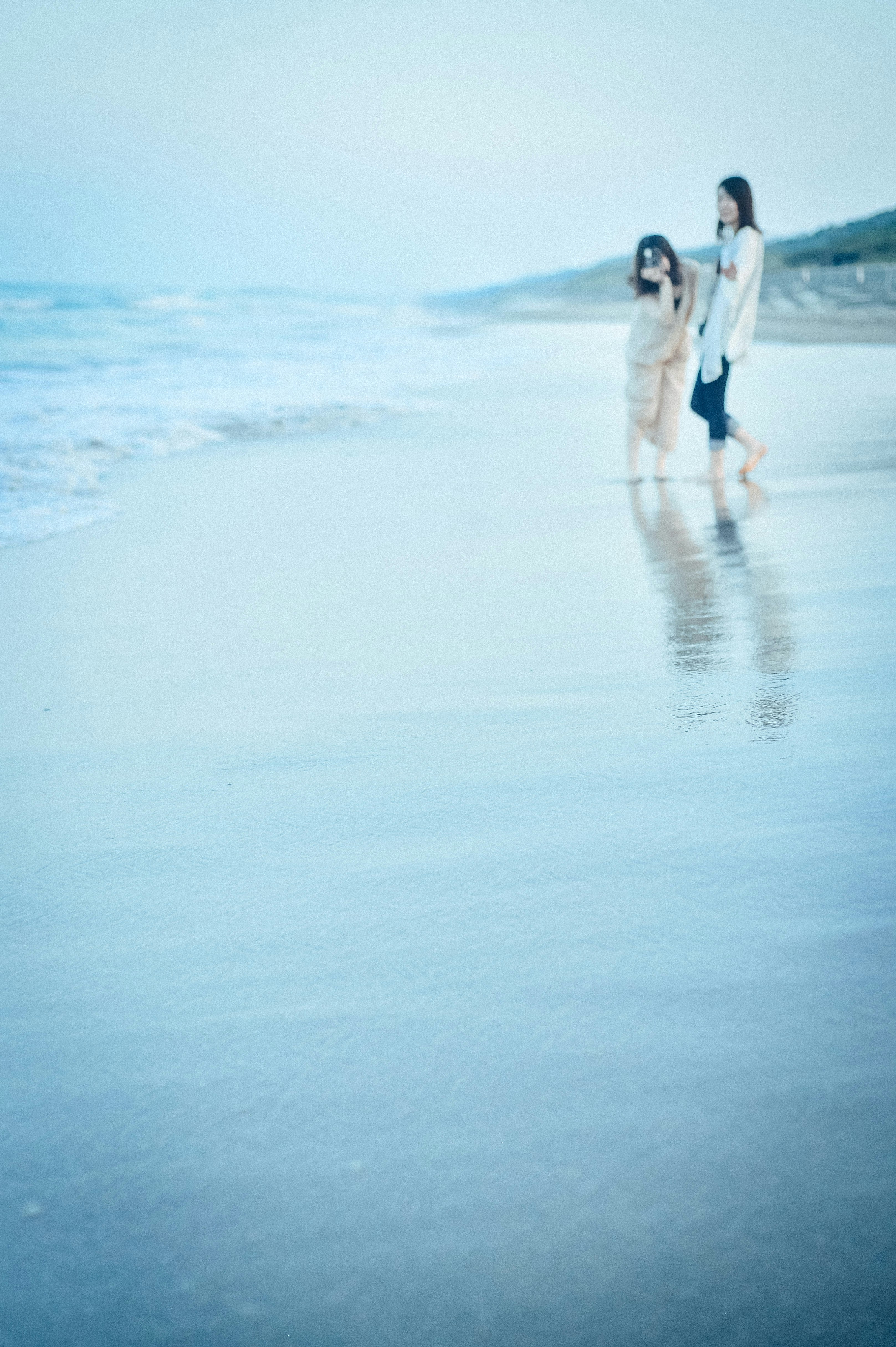
Image by hhhiroooki
For example, a photo of a lush green forest under a blue sky may be perceived as entirely 'Ao' from a Japanese perspective. This is because the refreshing and life-affirming elements of blue are emphasized.
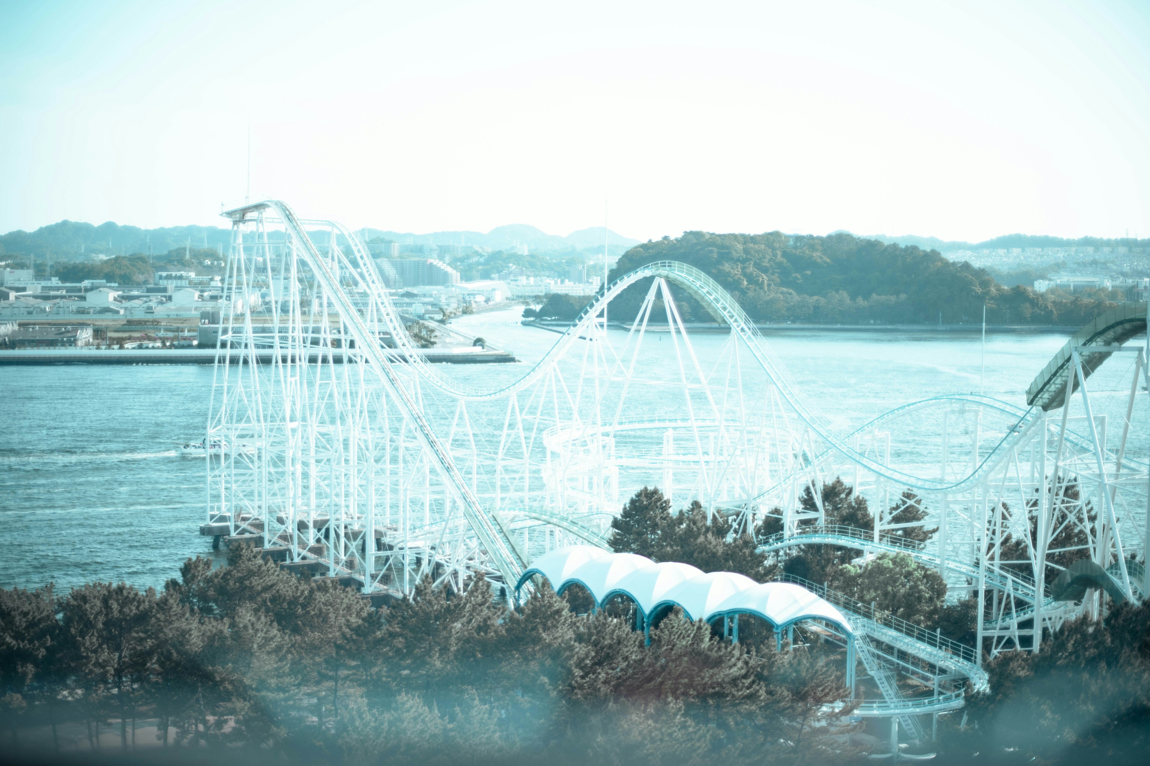
Image by fujikko
The English 'Blue'
On the other hand, in English, 'Blue' primarily refers to the color blue itself. The blue of the sky, the deep blue of the sea, all are recognized as 'Blue'. In English-speaking regions, blue and green are distinctly separated, with 'green' and 'blue' being strictly differentiated. Therefore, what is referred to as a 'green light' in English is called a 'blue signal' in Japan, and new green shoots are also described as 'green'.

Image by Tsubasa Mfg
In photography, images labeled as 'Blue' in English-speaking regions emphasize clear 'Blue', focusing on blue skies and seas. In scenes where blue and green coexist, green is recognized as green, and blue as blue, each treated as independent colors.
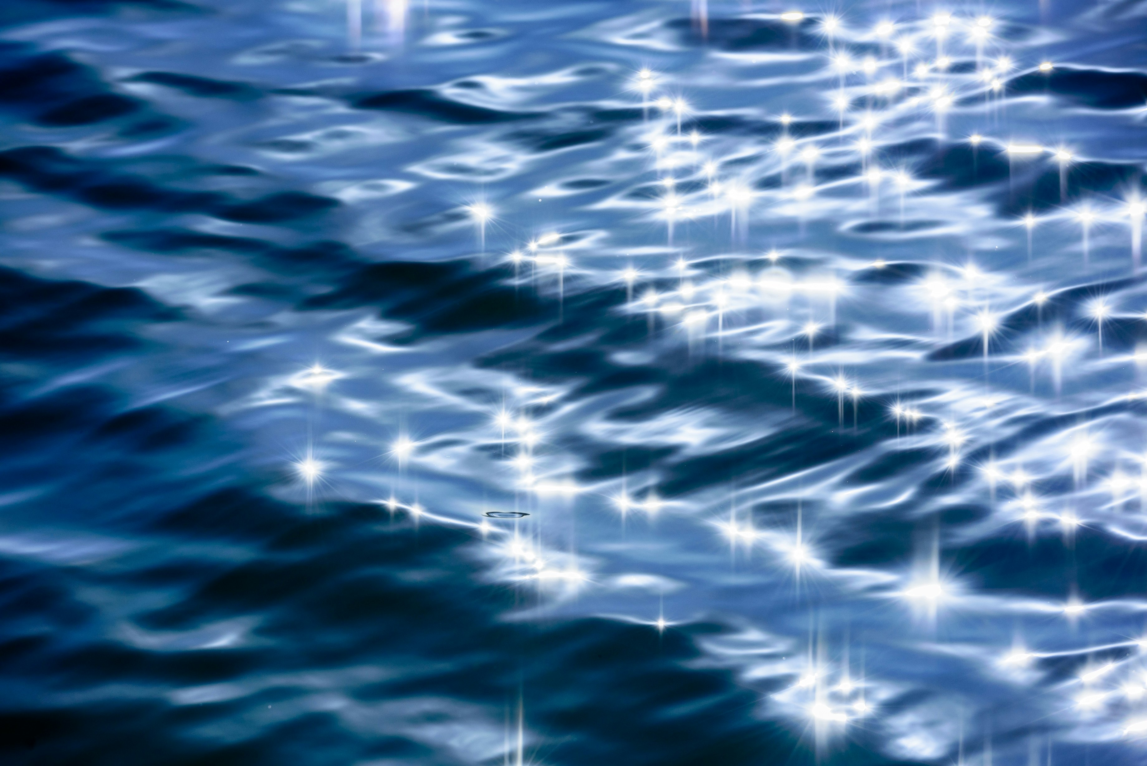
Image by nowphotoworks
Differences in Photographic Expression
By being aware of these linguistic differences when taking photos, color expression becomes richer. For instance, when focusing on the Japanese 'Ao', even green landscapes and fresh leaves are captured as part of 'Ao', resulting in a refreshing and cohesive work. Conversely, focusing on the English 'Blue' highlights the contrast between blue and green, creating dynamic photos.
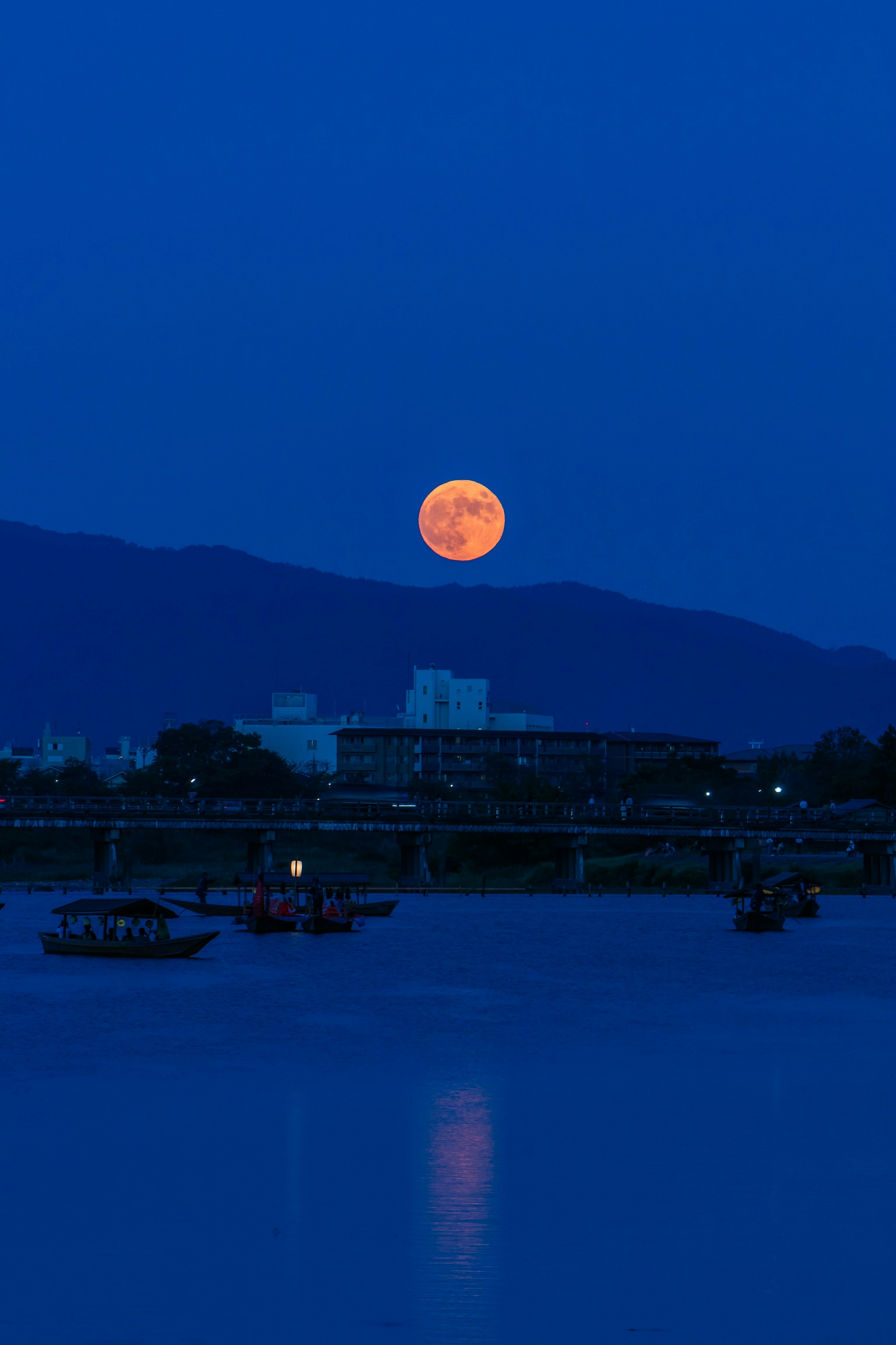
Image by kyokyo
Reasons for Different Color Perceptions
Color perception has evolved alongside human development. Early humans used color as a crucial clue in hunting and gathering. Green indicated safety, red signaled danger, making color a vital source of survival information. With such backgrounds, it's natural for different cultures to perceive colors differently.
Even today, colors have psychological effects. Blue is generally said to enhance concentration, which is why it's often used in office walls and website designs. Green also has a relaxing effect and is frequently used in cafes and medical facilities to emphasize a connection with nature.

Image by Tsubasa Mfg
Experiencing Color Differences Through Photography
Through photography, you can more concretely feel the differences in color. Especially in digital photography, color adjustments are easy, allowing intentional changes in color nuances. For example, by enhancing the blue tones during editing, you can give the entire photo a cool and serene impression. On the other hand, enhancing the green tones increases the richness of nature in the photo, giving it a warm and lively impression.
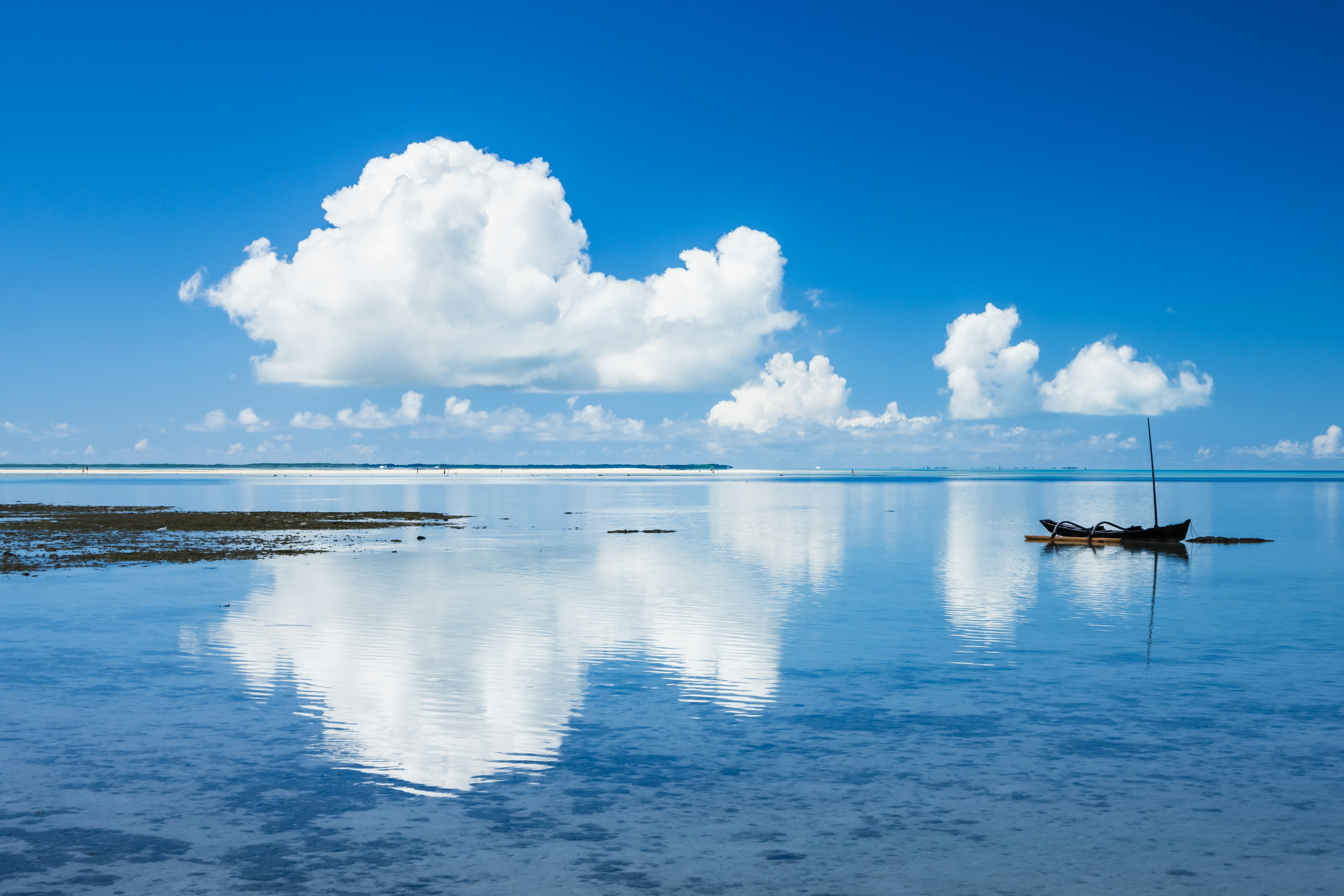
Image by S.Yasu Photo
Colors That Evoke Emotion
Colors also have the power to evoke emotions and memories. Seeing a blue sky can bring up feelings of freedom and a sense of adventure. The gradient from blue to red in a sunset sky evokes the calm of the day's end and hope for tomorrow. Meanwhile, photos of lush green forests bring a sense of nature's tranquility and healing.
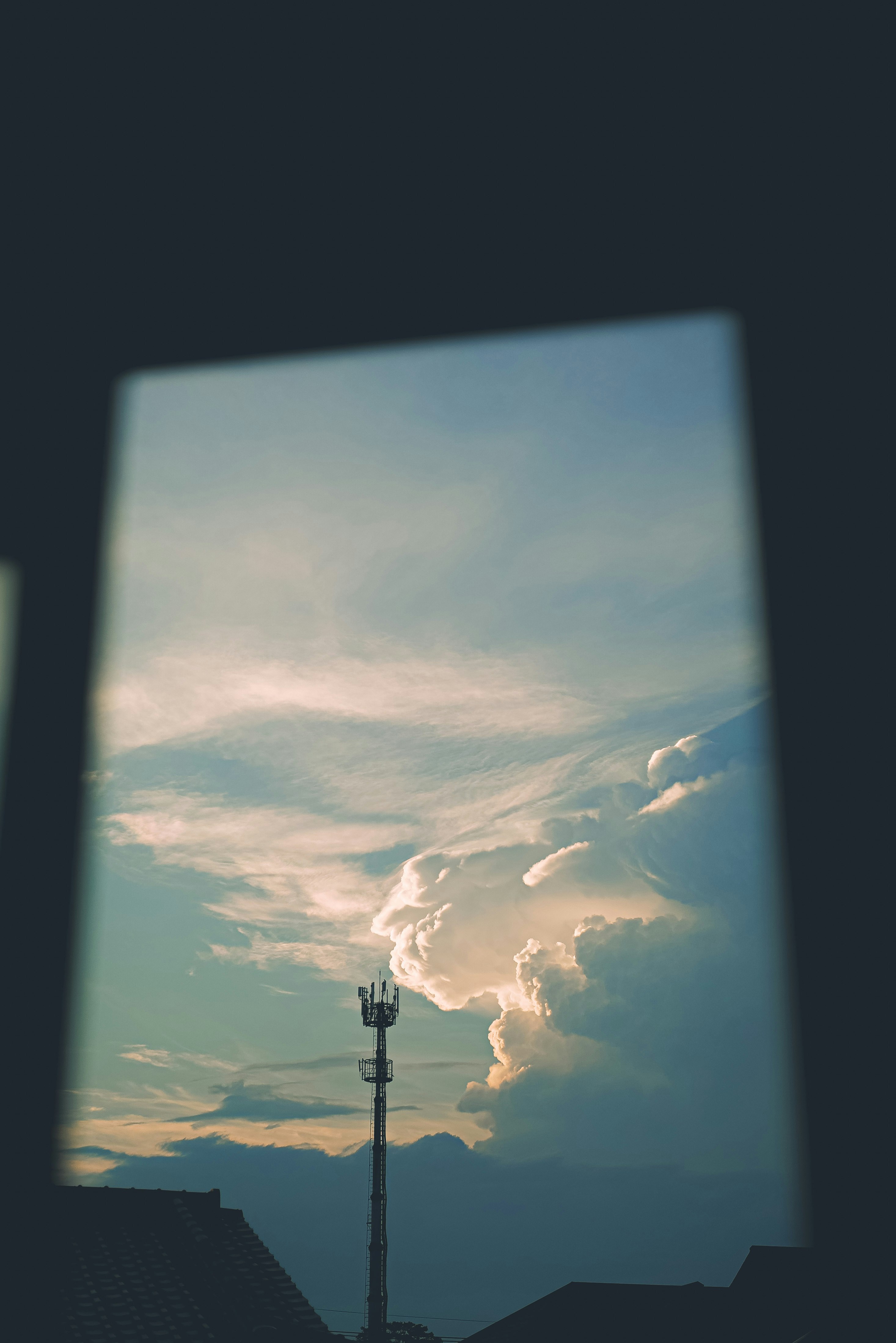
Image by hhhiroooki
The expanse of the Japanese 'Ao' reflects the deep connection between the Japanese language and nature. Blue skies, blue seas, and green mountains and forests—all are etched in the heart as part of 'Ao'.
Conversely, the English 'Blue' is a more limited color, emphasizing its depth and purity. Blue lakes and blue flowers all possess their unique beauty as 'Blue'.
Why not be aware of this difference through photography and capture a richer gradient of colors?


