
Cover photo by はくらく
Thank you for the many submissions to the hashtag campaign that was held recently.

We received many photos capturing expressions in various fonts!
We will feature and introduce a selection of works from the submissions gathered during this campaign.
Editor’s Choice #Font
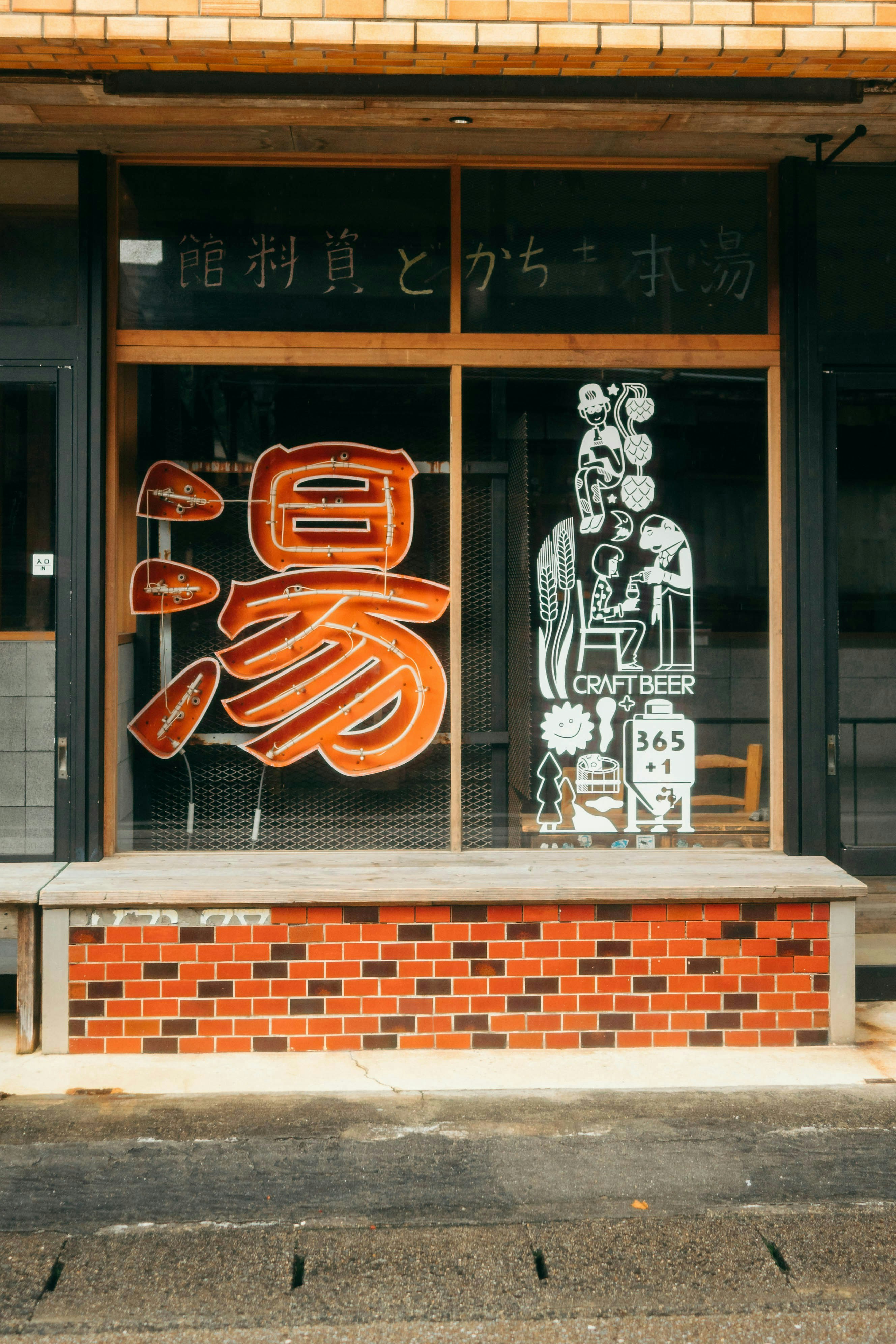
Photo by みやんこ
みやんこ
Nagato Onsen Village
cizucu Editorial Team
A shot from an onsen town in Nagato City, Yamaguchi Prefecture. The large '湯' character is a symbol of the onsen, likely to glow in neon at night. Amidst retro signs and tile-like wall patterns, the modern and stylish craft beer lettering adds a touch of tourist attraction.
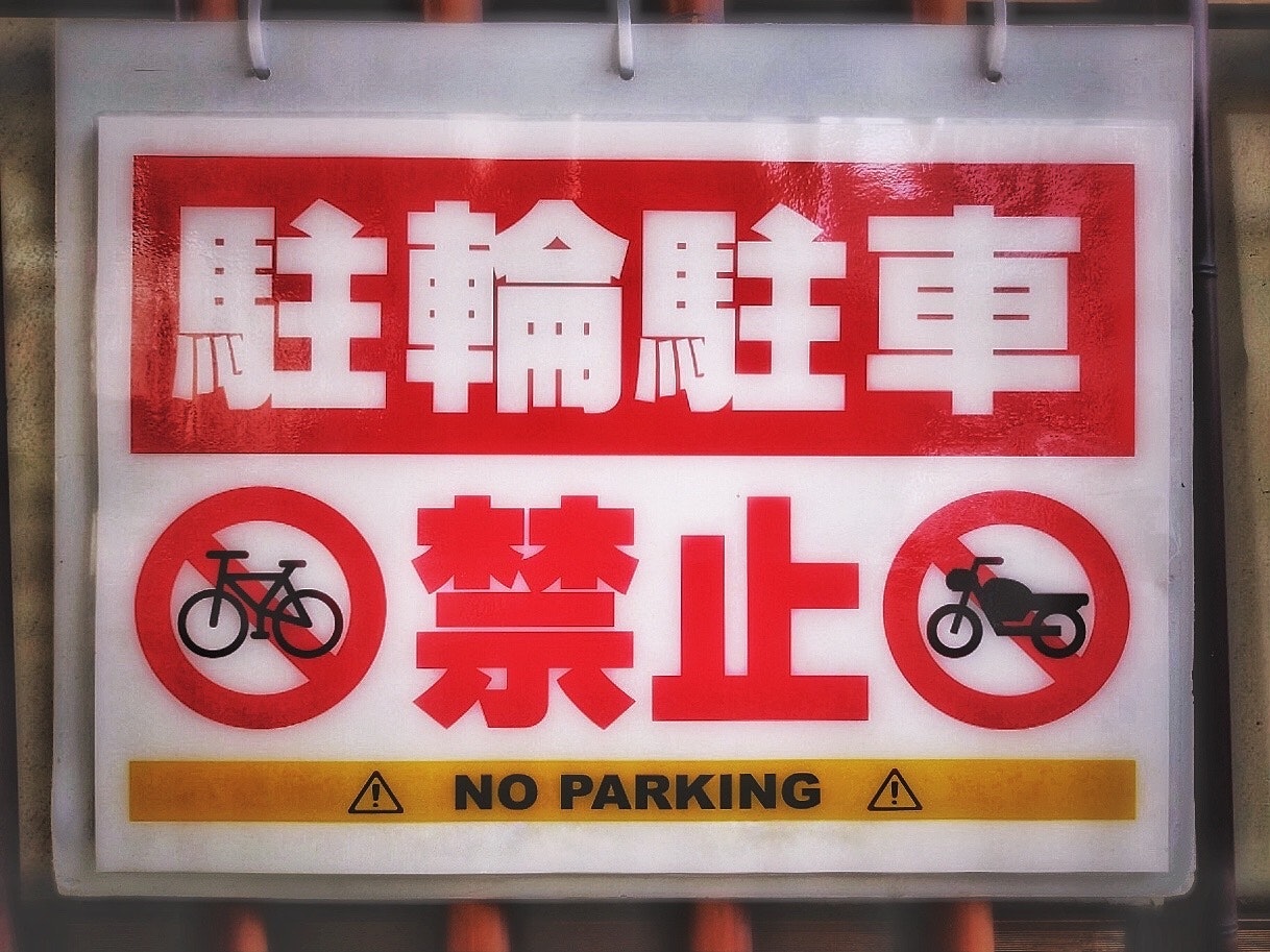
Photo by ユウ3850
ユウ3850
cizucu Editorial Team
A photo of a no parking sign. The red lettering that easily catches attention and the yellow-black combination indicating warning, along with the bold gothic font, make it highly noticeable. A good example of using appropriate colors and fonts according to the purpose.
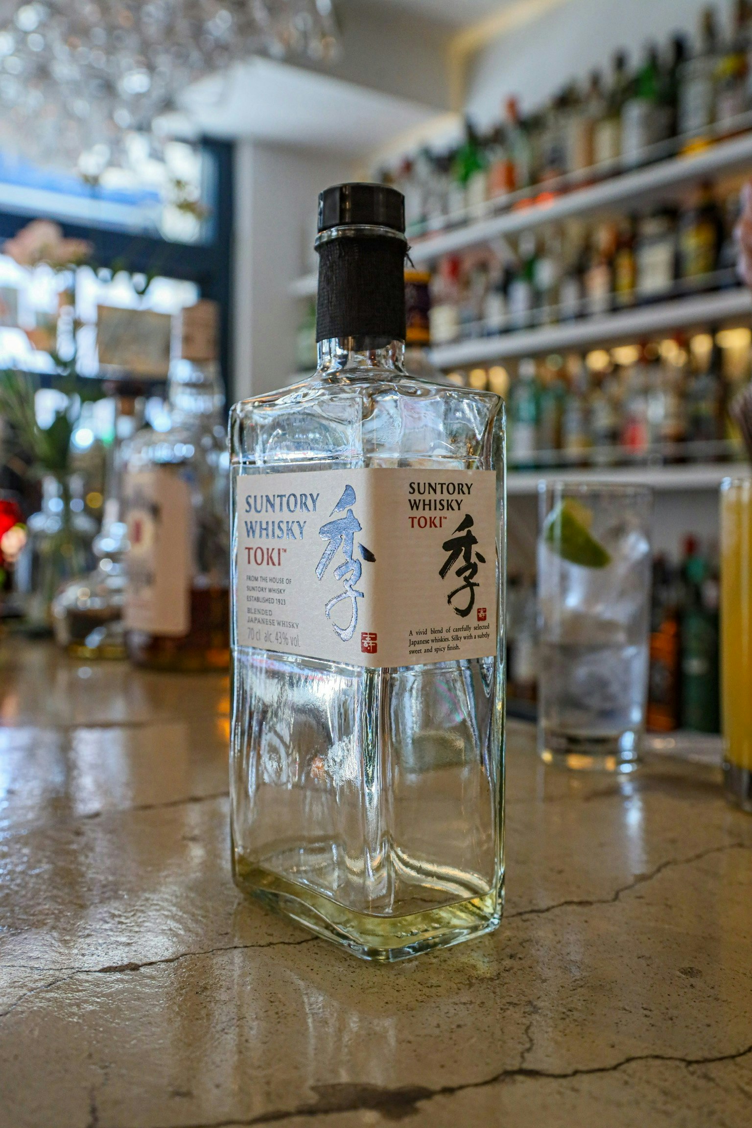
Photo by 季
季
cizucu Editorial Team
A photo of a whiskey bottle. The brand name '季' designed with brush strokes on the label instantly identifies this whiskey as Japanese. The brush lettering conveys not only 'Japan' but also a sense of 'dedication' and 'confidence'.
In Conclusion
What did you think?
Even as you read this magazine, you might notice some text if you look up.
Fonts are often overlooked, but considering why a particular font is used might reveal hidden insights!
cizucu hosts hashtag campaigns and photo contests to inspire photographic activities. Register on the app and check out the latest content.


