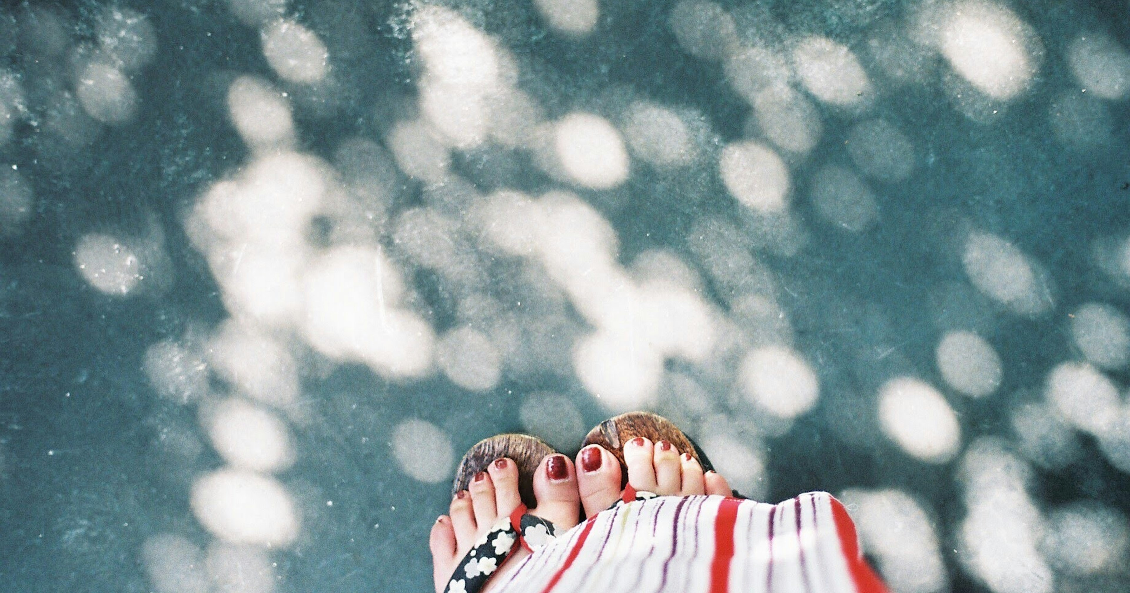
cover image by Tsubasa Mfg
Thank you for participating in the hashtag campaign that was held recently!
By focusing on the fonts of letters we casually pass by, you might have felt the change in impression and information conveyed by fonts.
This time, we will feature and introduce several works from the submissions gathered during the hashtag campaign.

Even though the content being conveyed is supposed to be the same, the impression can change significantly depending on the font. When you think about it, fonts are quite fascinating, aren't they?
Even fonts that deviate from the neat handwriting taught in textbooks can be surprisingly readable and recognized as having character.
The works submitted by everyone were filled with unique fonts, making it a wonderful hashtag campaign.
Now, let us introduce the works that particularly caught our attention!
Editor’s Choice #Font
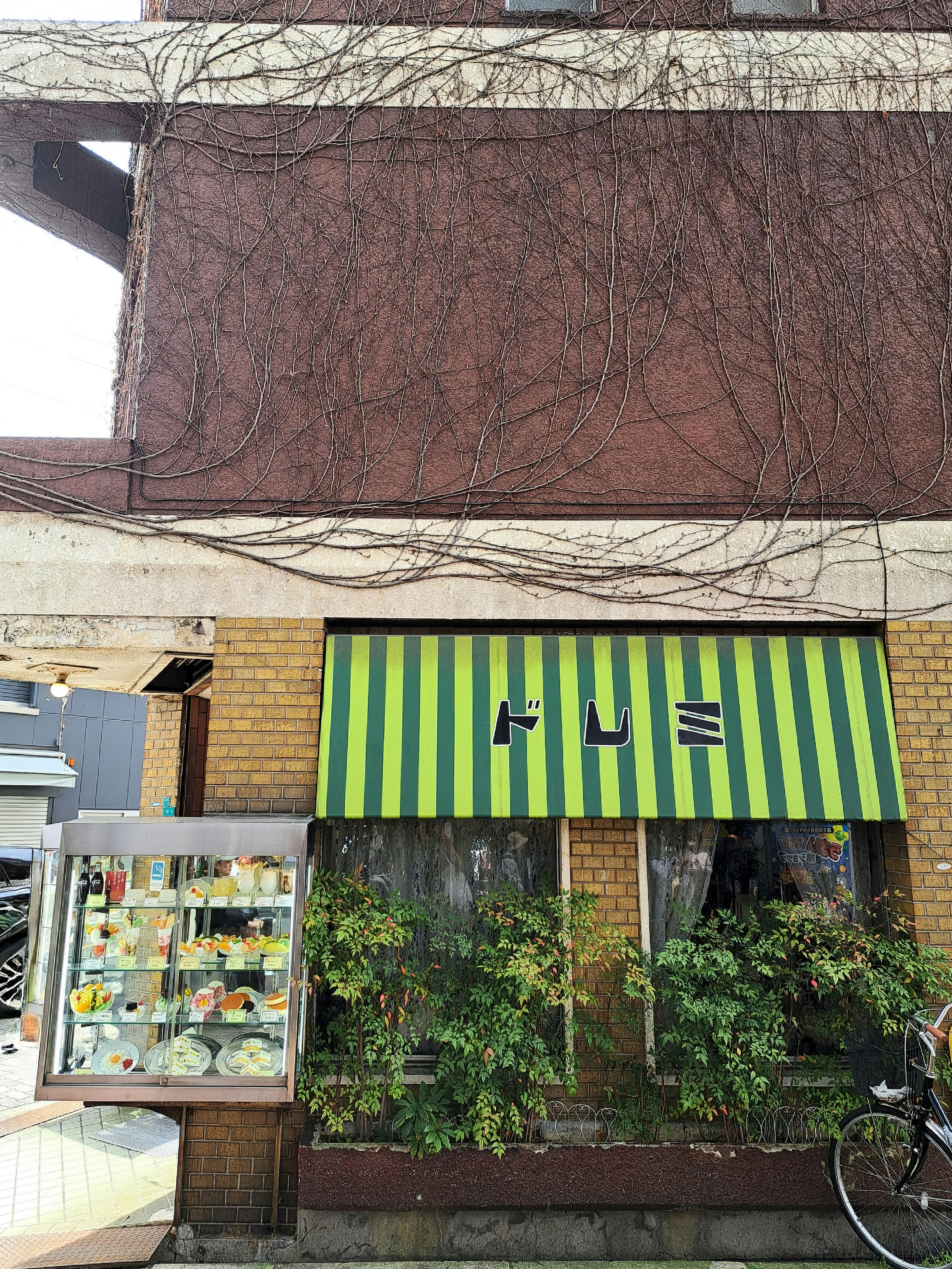
Image by bikkya
cizucu Editorial Team
The eye-catching watermelon color may not match the atmosphere, but it certainly has impact. The font itself is quite distorted and doesn't give the feel of an old-fashioned coffee shop.
This lack of overall cohesion gives off the vibe of a local, old-fashioned café. Considering the store name is 'Doremi', one wonders why they didn't go with a black and white striped pattern like a keyboard.
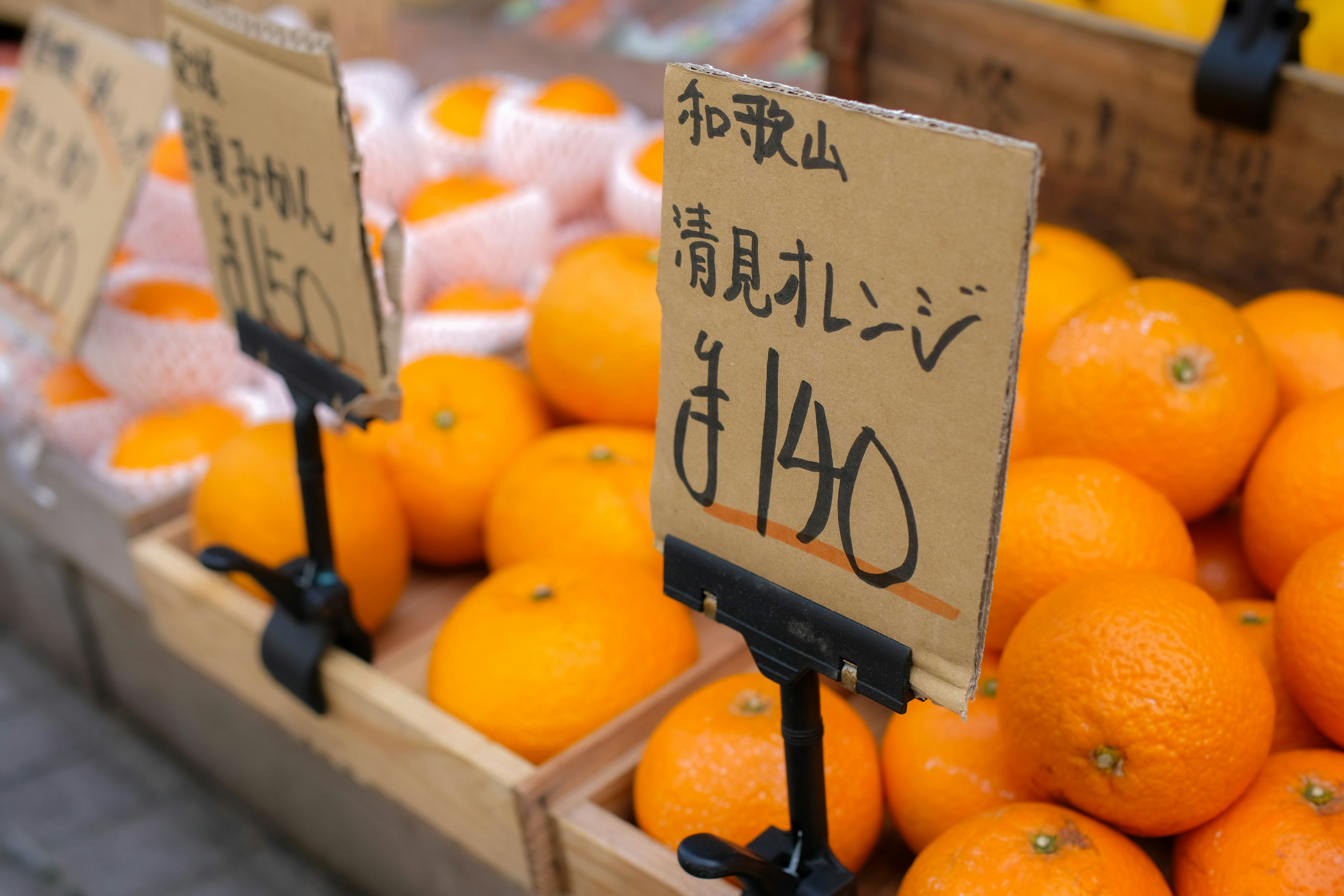
Image by shizuku
cizucu Editorial Team
A price tag handwritten with a marker on a piece of cardboard. The charm of handwriting lies in the sense of human presence it conveys. In this work, one might imagine a friendly old man in overalls and a cap, but what do you think? The quirky '¥' symbol is also a nice touch!
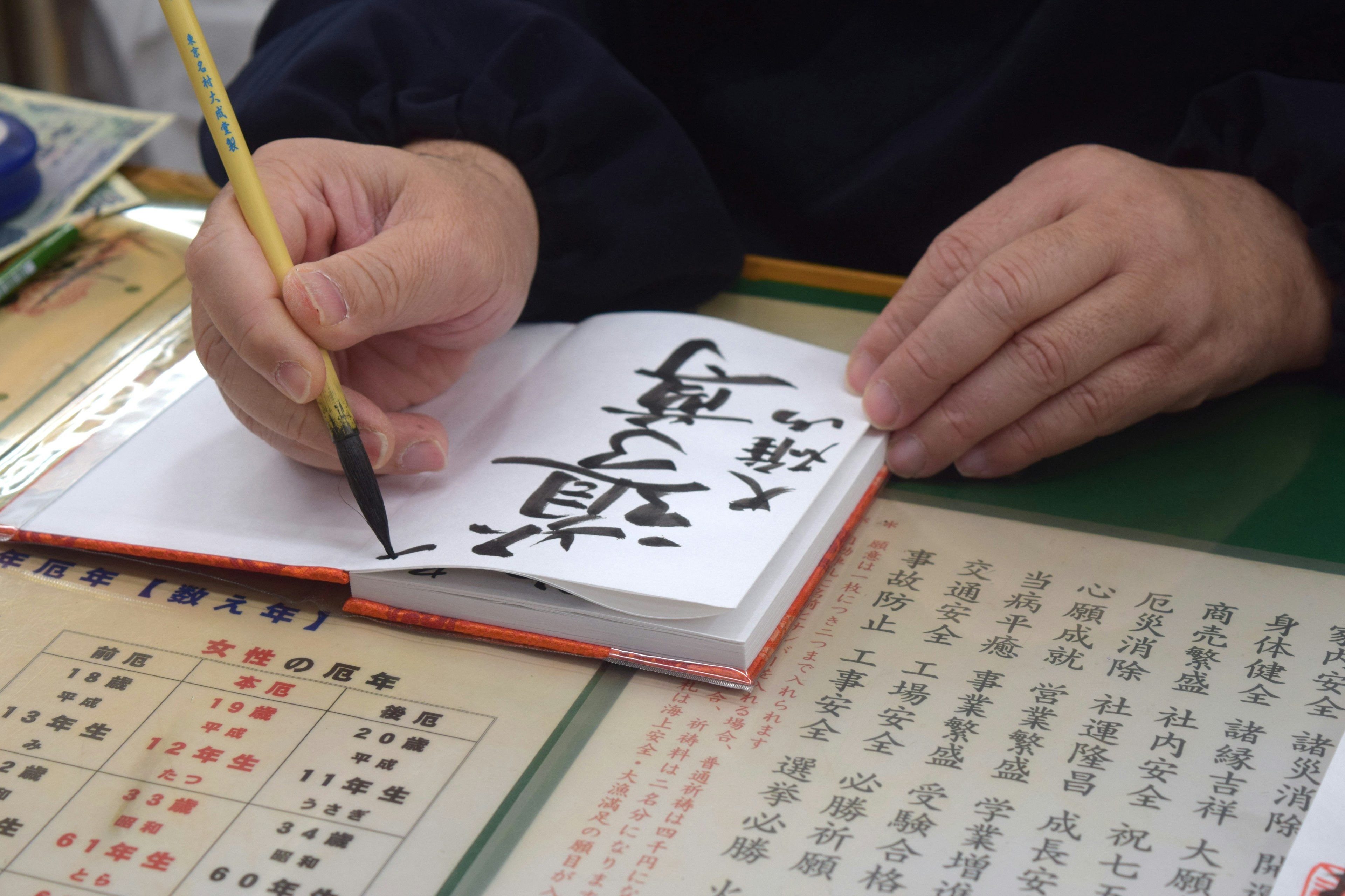
Image by tamu1500
cizucu Editorial Team
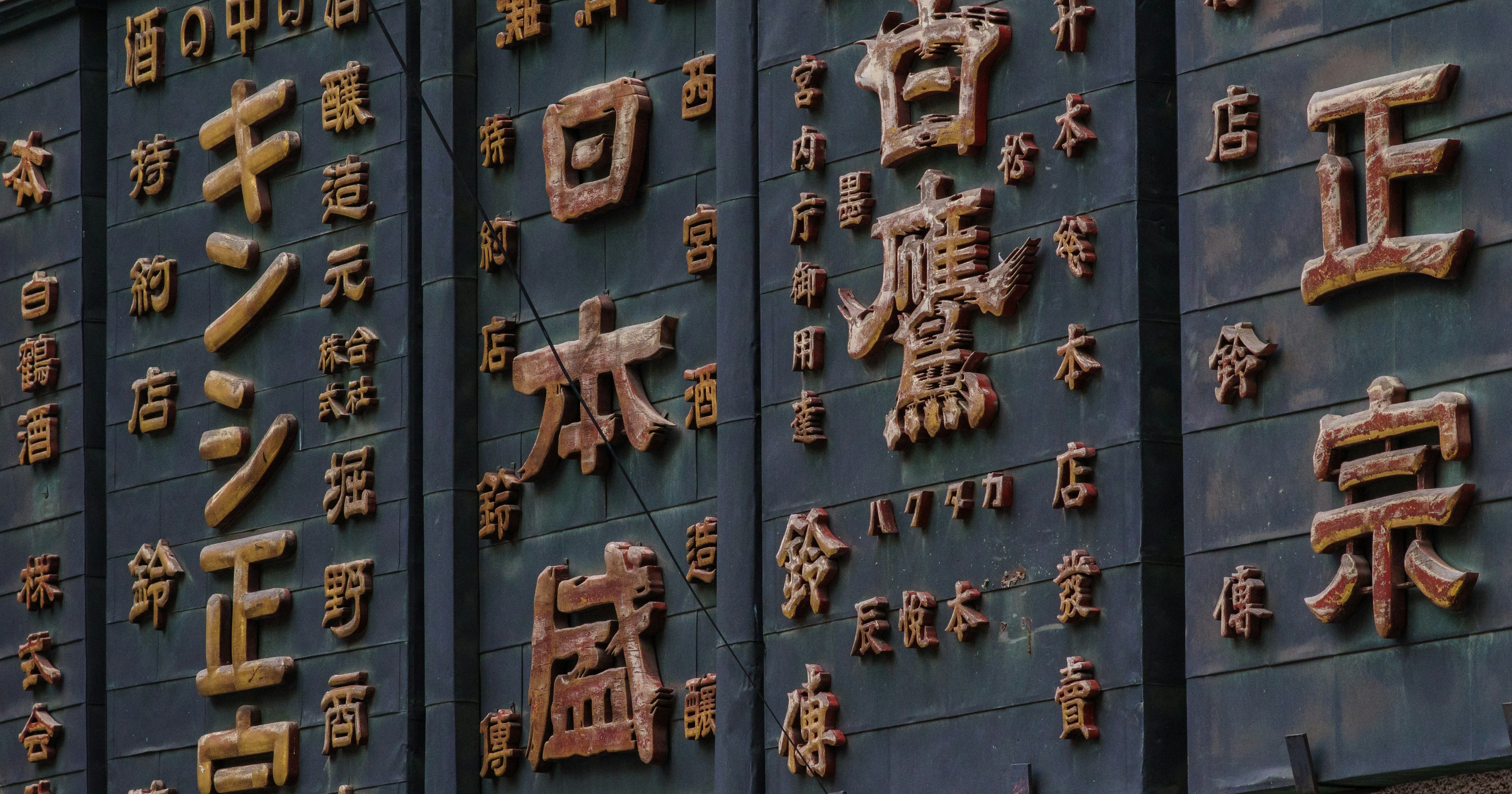
Each goshuin is handwritten by craftsmen. The beauty of kanji, characterized by strokes, hooks, and sweeps, is accentuated by the brush, enhancing the value of the goshuin itself. Since they are handwritten, no two goshuin are the same, which might be the charm of collecting them. Even if the characters are by a professional calligrapher, they would feel bland if printed or stamped.
Finally
What do you think?
When reading text, fonts are always an accompanying element. In the case of store or product names, they can also affect branding. Conversely, if you can master the use of fonts, you might easily create a good impression. It is said that there are over 7000 types of fonts in Japanese alone, and the depth is still vast.
If you come across interesting or unique fonts in the future, please post them with !